Redesigning a quiz app for students on weak networks, reading in a second language
The quiz app was the organisation's hero product, the one with the highest engagement among students. The goal was to raise adoption so students from less privileged families could improve in their studies. We started in 2020, during the pandemic, so every interview and test was remote and our margin of error was higher. I led the research, found six reasons students struggled, and we split the work into phases: first fix the confusing interactions and close 80% of the gaps, then improve the self-paced learning journey and add rewards. In 2021, after the new app launched, the organisation gave away more than 100,000 free devices to students from low-income families, all with the new app preinstalled.
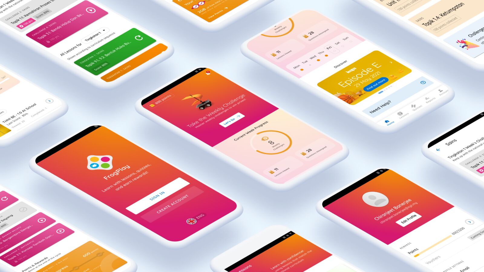
The student this was for
The app supported self-paced learning, with games built in for students to play. The content was curated by education practitioners and aligned with the national curriculum, so the learning itself was sound.
The business goal was adoption among school students, so that those from less privileged families could get a chance to improve in their studies. That decided whose experience mattered most. If the app was hard to use, the students who stood to gain the most were the ones most likely to give up.
Walk the old app with them
Research found six reasons students struggled. Read in order, they are one student's session, going wrong at every step.
- They open the app, and it is slow. Load times were high, and in areas with a poor network it was hard to use at all.
- The words are not theirs. The interface was not in the local language.
- They look for something to learn, and it takes too long. Time to discover content was high.
- They try the thing they came for, and it is the hardest part. The most important flows had the most difficult interactions.
- They reach a screen with nowhere to go. The app had dead ends in the journey.
- None of it is shaped around how they learn. The overall journey lacked a student-centred approach.
The first two hit hardest for this audience. A student on a weak connection, reading in a language that is not their own, feels every other problem more.
The catch: we could not sit beside them
The project began in 2020, when everyone had moved to working from home. While we were all getting used to the new normal, we were still working out how to bring physical collaboration online.
All user research and usability tests were done remotely. We could see the margin of error in our findings was much higher than in person. Rather than bet on one big redesign, we decided after the first research round to break the project into phases, so each release could be checked before the next one built on it.
Rebuilding the path
The work ran in two phases within a year.
- Phase 1: redesign the whole app on Material Design guidelines, remove the confusing interaction patterns, and close 80% of the gaps we had found.
- Phase 2: improve the self-paced learning journey, add more relevant content, and introduce a reward system.
Material Design gave us a tested, familiar set of patterns to replace the confusing ones, instead of inventing new interactions students would have to learn. I created a design system on top of it so the redesign stayed consistent as the app grew in phase 2. Fixing the basics first meant the more ambitious learning features would sit on a structure students could already use.
Iteration 1
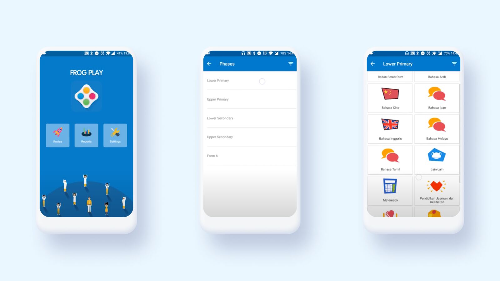
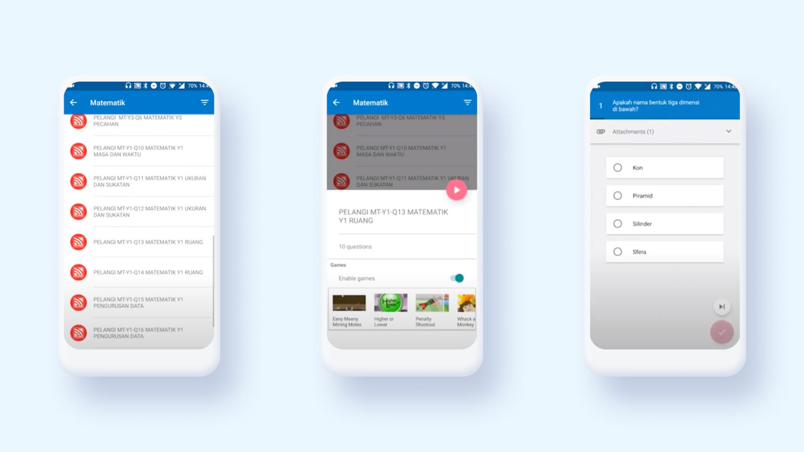
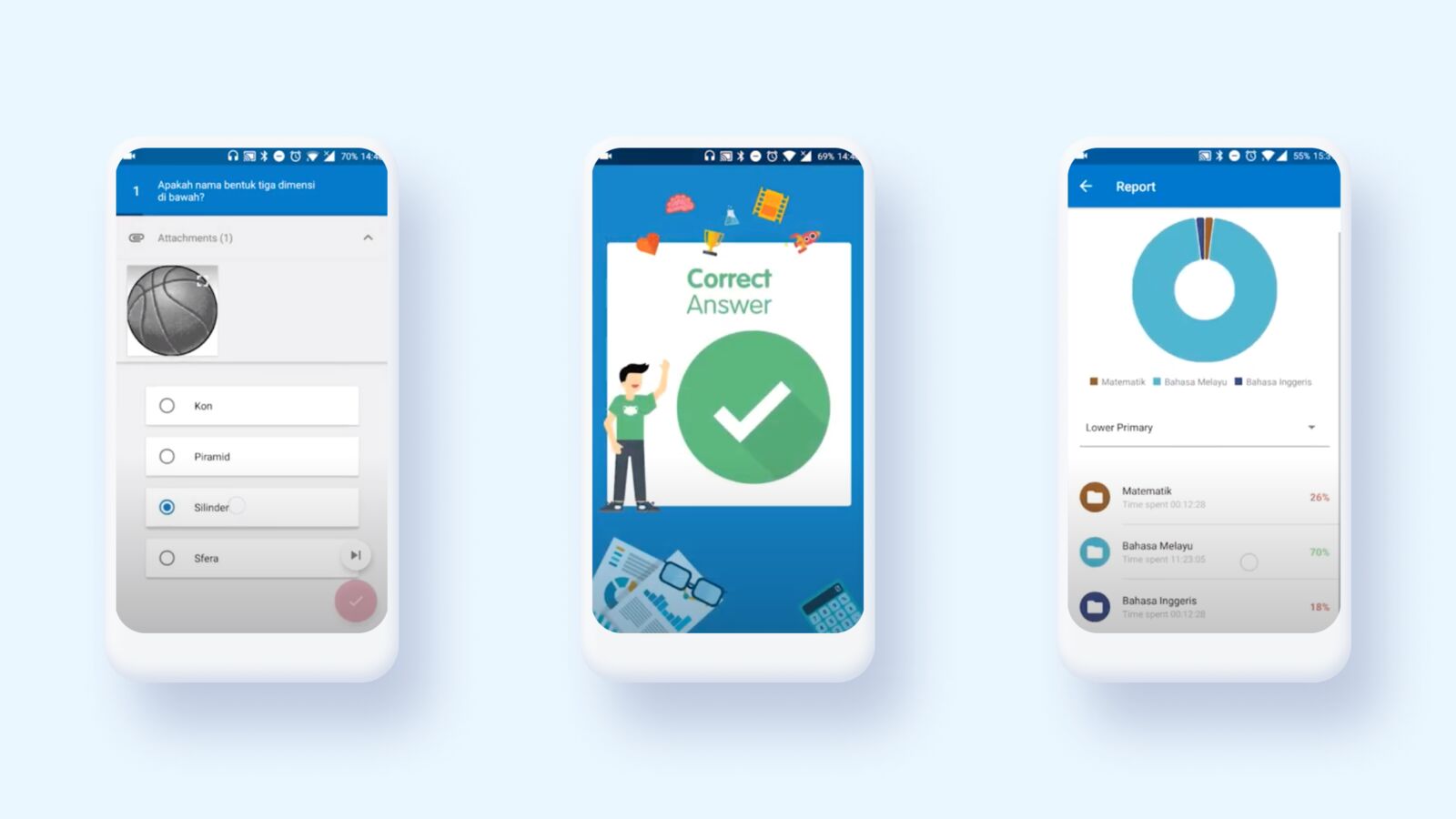
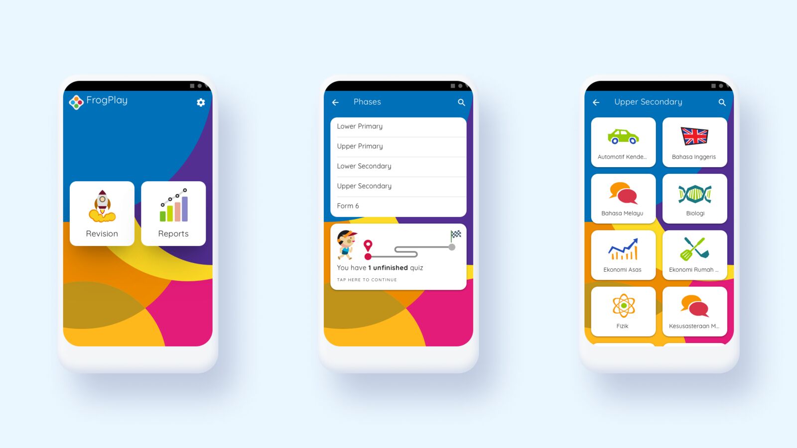
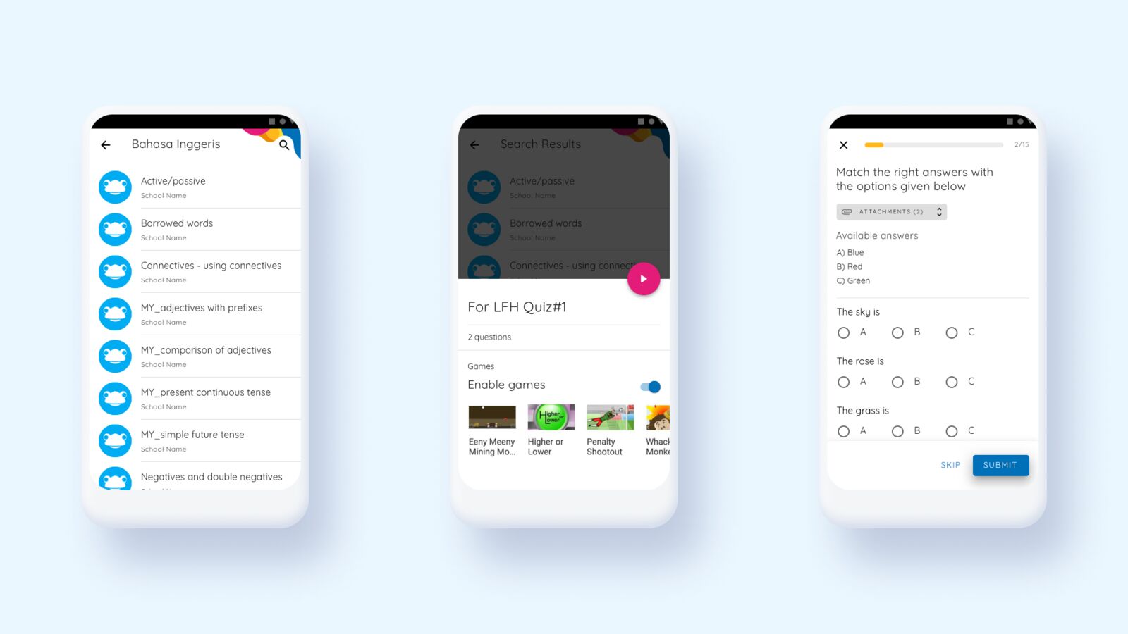
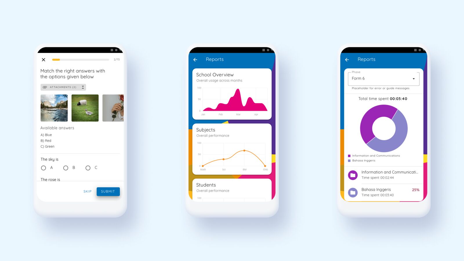
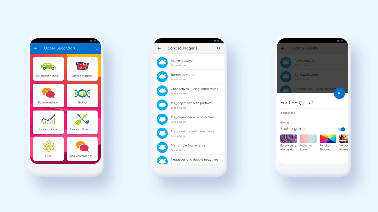
The first iteration rebuilt the home screen, subject navigation and quiz flow.
Phase 1, final version
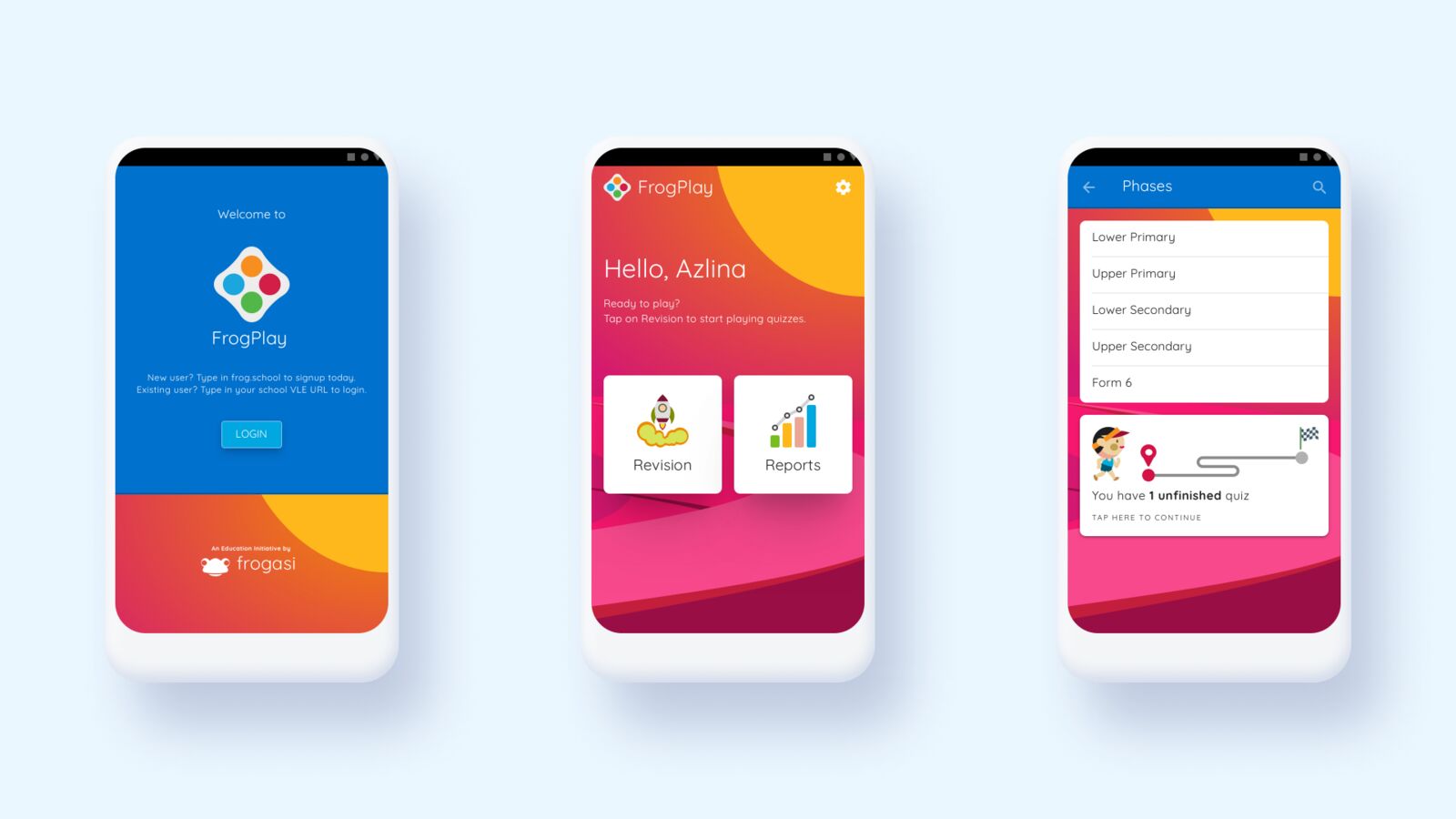
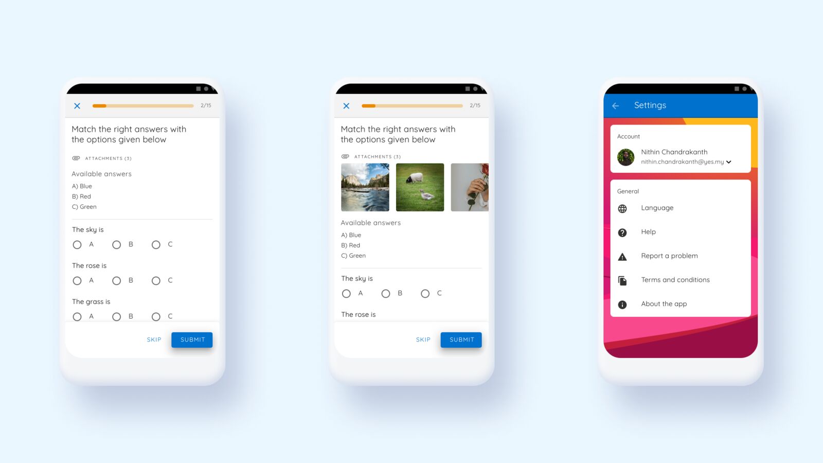
The final phase 1 design: a clearer welcome and home, a colour-coded subject grid, simpler quiz screens and a straightforward settings area.
Where the path led
- A redesigned app on every free device. In 2021, after the new app launched, the organisation gave away more than 100,000 free devices to students from low-income families, all with the new app preinstalled.
- 80% of the gaps targeted in the first phase, with the learning journey and rewards planned for the second.
- A design system the later phase could build on.
My part
- Lead user research and analysis
- Define the design strategy
- Create task flows
- Rapid prototyping
- UI design
- Lead usability testing
- Create the design system
If I did it again
- Plan for remote research from the start. We learned to work around a higher margin of error. With more time I would have run more frequent, smaller remote tests to narrow it.
- Measure adoption per phase. Phasing the work was right. Tracking engagement after each phase would have made the case for the next one stronger.
What stays with me: design for the hardest conditions first, because a weak network and a second language expose every weakness in a flow. And when research is less certain, release in smaller steps.
This project is under NDA, so confidential details are left out or obscured.
Want the longer version of this story?
I can walk you through the decisions, the trade-offs and what I would do next.