51 clicks to add one student: testing a school admin redesign
Teachers who ran day-to-day school admin were losing teaching time to a user management tool built in 2012. It also had to work for schools in different countries, each with its own way of doing things. I mapped the old navigation to find where its structure failed, rebuilt the flows around how users said they would arrange the information, then tested wireframes and prototypes before the final design. In testing, adding a new student with both parents dropped from more than 51 clicks and over 8 minutes to 25 clicks and under 3 minutes. After launch, support tickets fell by more than 50%, and the time to complete complex, frequent tasks fell by more than 20%.
Written up the way the work ran: like an experiment.
The question
Could a better structure give teachers back the time that clerical work was taking?
In many schools, the person who manages users is a teacher with admin duties on top of teaching. Every student added, every parent linked and every account archived came out of their day.
The vision we worked to:
Create an experience that enables and encourages schools and users to conveniently input information into Frog, and use the information to power the automation of user workflows and recommendations.
The logic was simple. Clean data in means the platform can automate more of the routine later. So the first job was to make putting information in easy.
The subject
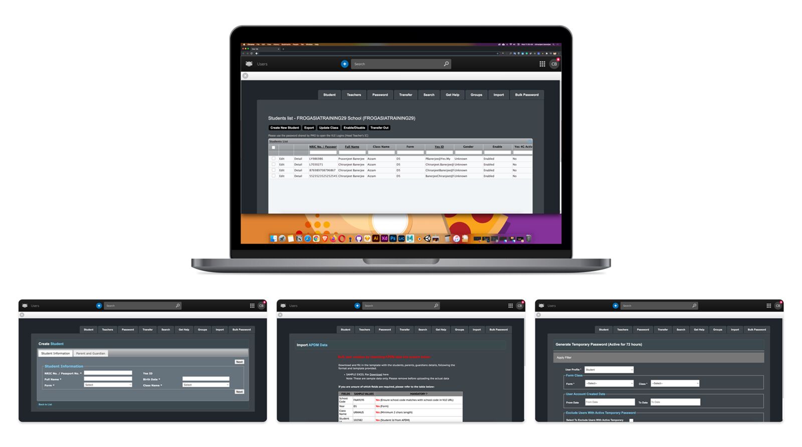
The tool was built in 2012 and was due for a rebuild. It had two problems that made it more than a facelift:
- The structure fought people. Common tasks were buried in the wrong places, so simple jobs took many steps.
- It had to work globally. Schools in different countries run different task flows. The solution had to flex to those differences instead of forcing one way of working.
Method
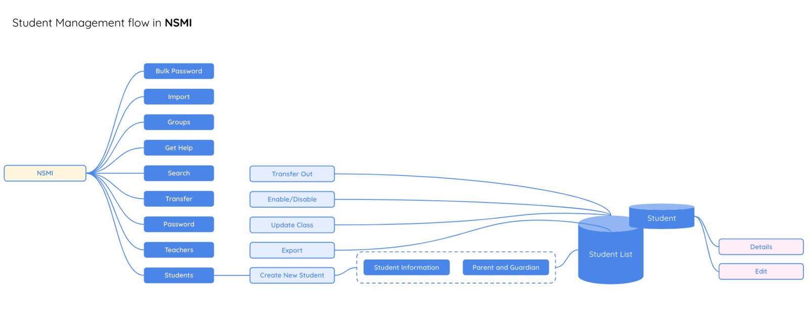
Step 1. Map the old structure. I plotted a high-level user flow of the existing application. Seeing the whole navigation on one page showed where the hierarchy was flawed and why simple jobs took so many steps.
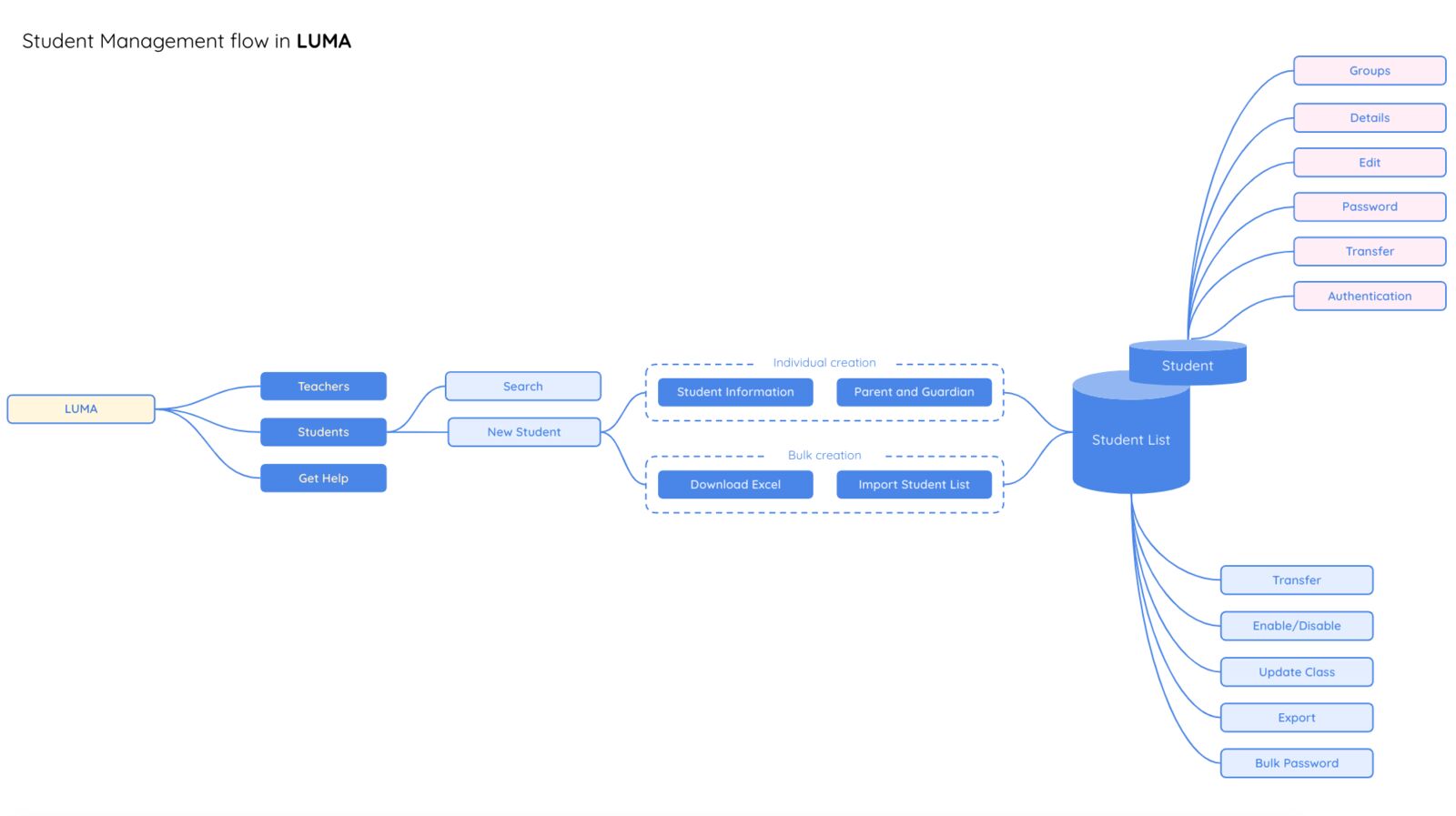
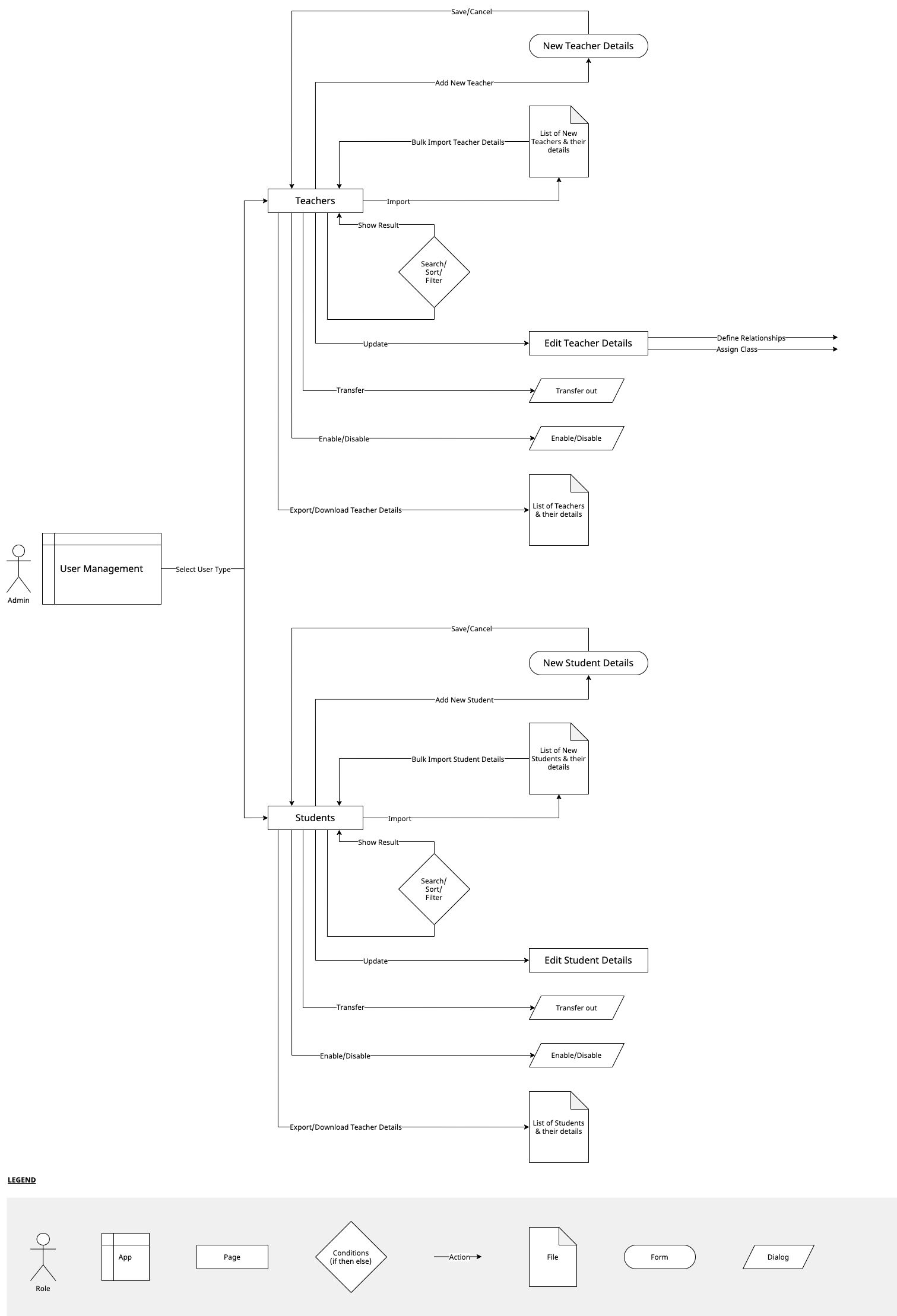
Step 2. Rebuild it around how users arrange information. From user feedback, and from how users told us they would naturally arrange the information, I revised the user flow and proposed a new navigation. I also mapped how an admin manages different user types, because those relationships were where most of the clicks went.
Step 3. Wireframes with internal teams. With the flows settled, I built wireframes and ran an observational study with internal teams to get quick feedback on how to arrange information on each screen.
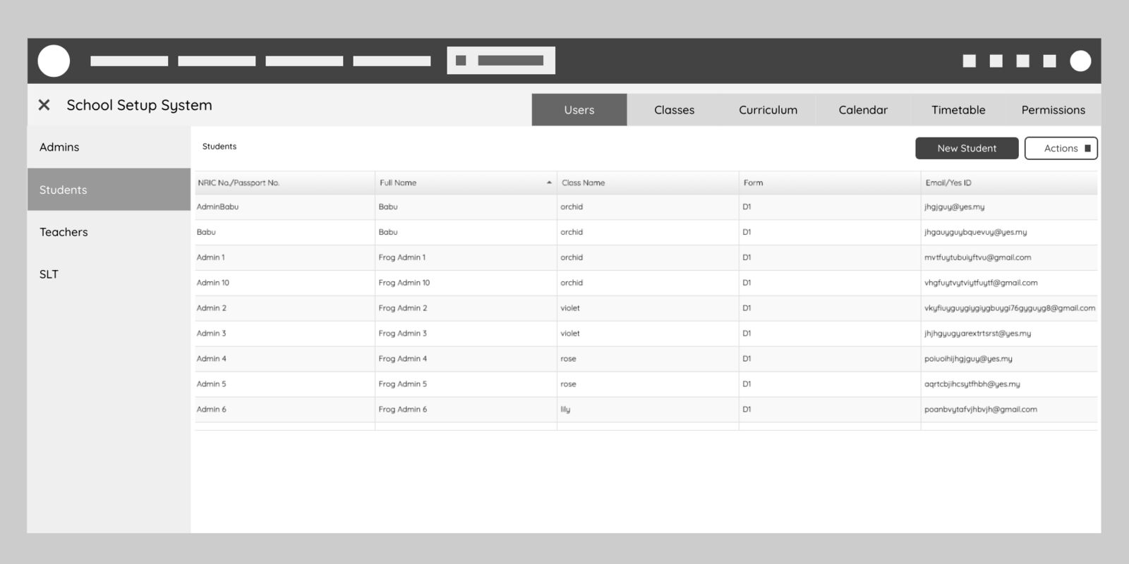
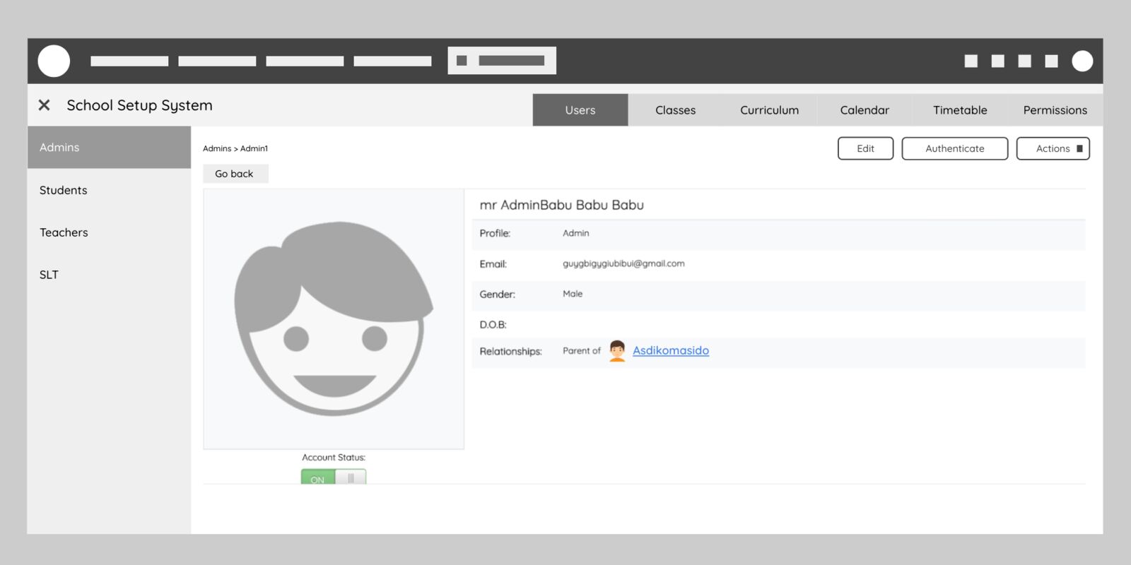
The study also showed its own limit. The people we were designing for needed something closer to the real product to give meaningful feedback. Grey boxes were not enough. So I moved to rapid prototyping.
Step 4. Prototype test: does it fit the market? Did the features meet what schools needed, and how satisfied were people likely to be in real use?
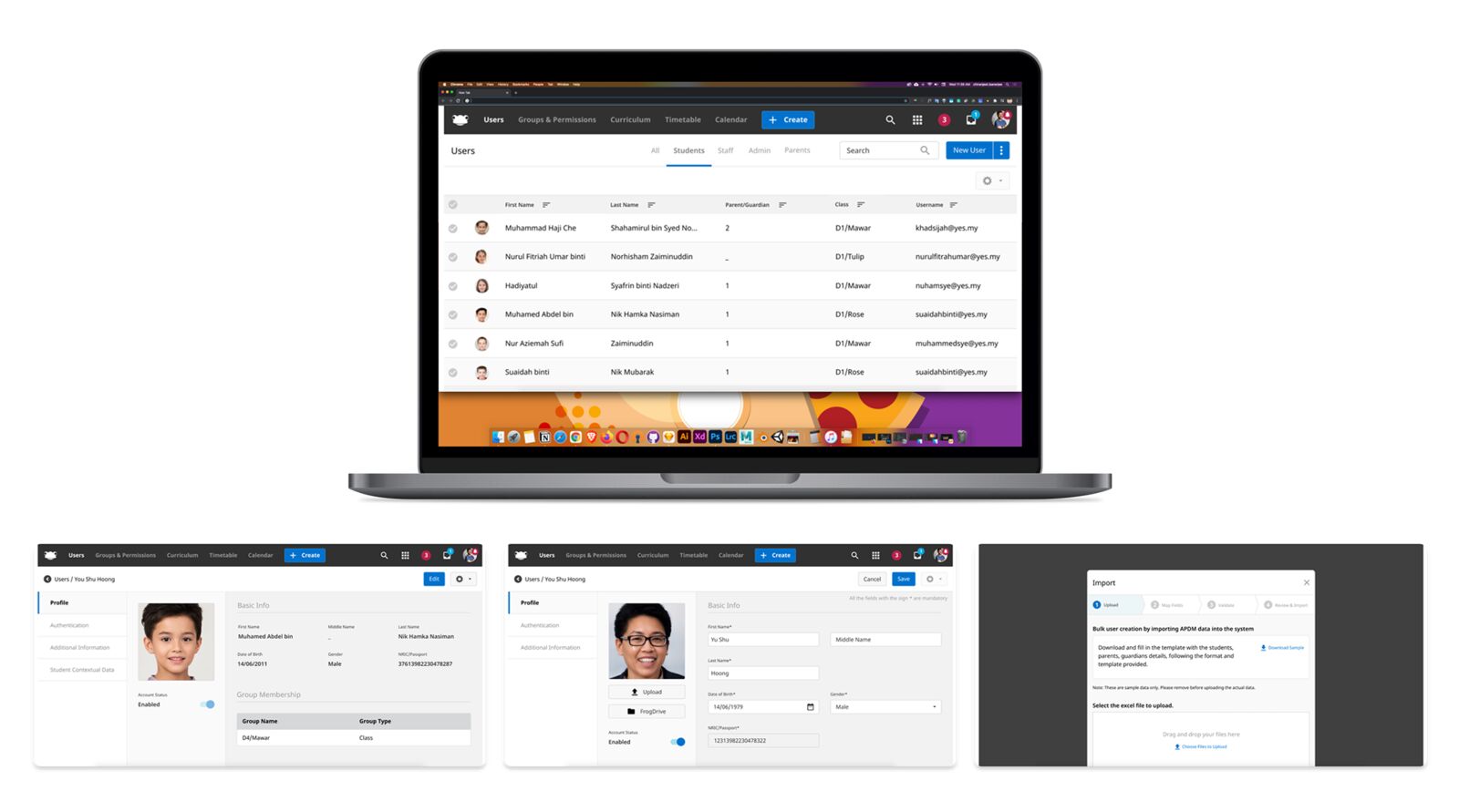
Step 5. Final test: is it easy? Were the features easy to use and the design intuitive? Detailed feedback on where testers struggled let us either fix the design straight away or prepare the support team for those moments. Watching unscripted use also showed benefits we had not planned for.
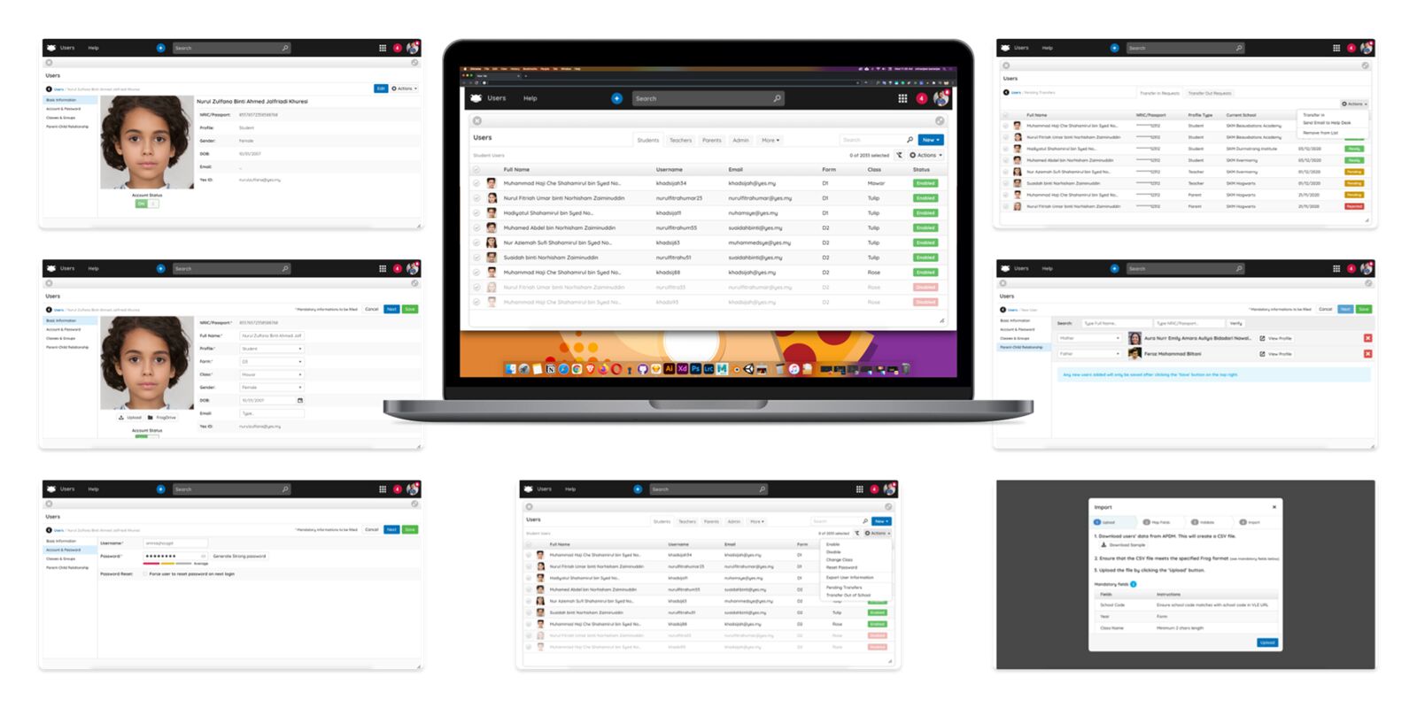
Results
Three common tasks, current tool against the new design:
| Task | Current tool | New design |
|---|---|---|
| Add a new student with a father and a mother | About 17 clicks per user, more than 51 clicks for 3 users; over 8 minutes | About 12 clicks per user, with 6 clicks for the relationship; 25 clicks for 3 users; under 3 minutes |
| Add a child to an existing teacher | About 16 clicks; over 3 minutes | About 12 clicks; under 1.5 minutes |
| Archive or disable users | About 4 clicks per user, plus 1 per extra user; over 2 minutes | About 3 clicks per user, plus 1 per extra user; under 1 minute |
Participants rated statements about each version:
| Statement | Current | New |
|---|---|---|
| I was able to easily complete all the 3 tasks given | 7.4 | 8.6 |
| I understand what I was being shown | 8.8 | 8.8 |
| I know where to click to find things I need | 8.4 | 9.0 |
| I know what I can do next | 8.0 | 8.4 |
| The items I've explored are useful and relevant to me | 9.0 | 8.8 |
| I believe it will be convenient to manage my school users on this app | 7.8 | 8.6 |
| I wouldn't mind using the app again | 7.0 | 8.8 |
The anomaly
One score went down: how useful and relevant the items felt. Faster flows did not make the content itself more relevant. Structure and content are separate problems, and this test only fixed one of them.
A second detail is worth noting. Most participants were new to this tool, and most already knew another school app, yet they described the new design as cleaner and friendlier than the app they were used to.
After launch
- Support tickets fell by more than 50%.
- Time to complete complex, frequent tasks fell by more than 20%, based on qualitative tests.
- About half the clicks for the most common job, adding a student and both parents.
Limitations, and the next experiment
- Too few markets in the room. The design had to flex across countries. Testing with schools from each market would have shown which variations mattered most.
- Realistic prototypes sooner. The wireframe study taught us something, but it also showed these users judge best when they can see the real thing.
The protocol I reuse
- Map the old structure before designing the new one. Most usability problems in admin tools are hierarchy problems.
- Count the clicks. A before-and-after table on the most common tasks is evidence anyone in the room can read.
- Report the score that went down. It tells you what to fix next.
Some details are left out or blurred under NDA.
Want the longer version of this story?
I can walk you through the decisions, the trade-offs and what I would do next.