One regional telco website, three attempts, told out of order
A regional telco's website had a conversion problem. People arrived, saw a wall of banners, could not tell why this brand beat its competitors, and left. I had been part of the pitch that stumbled and a reskin that fell short. A year later the full redesign landed on me. We read twelve months of analytics, mapped the broken information architecture across a wall of paper, gave every campaign team a place on the page without letting any of them shout, and designed an AI discovery assistant that reads intent from where people click. The client signed a retainer that has now run for more than a year.
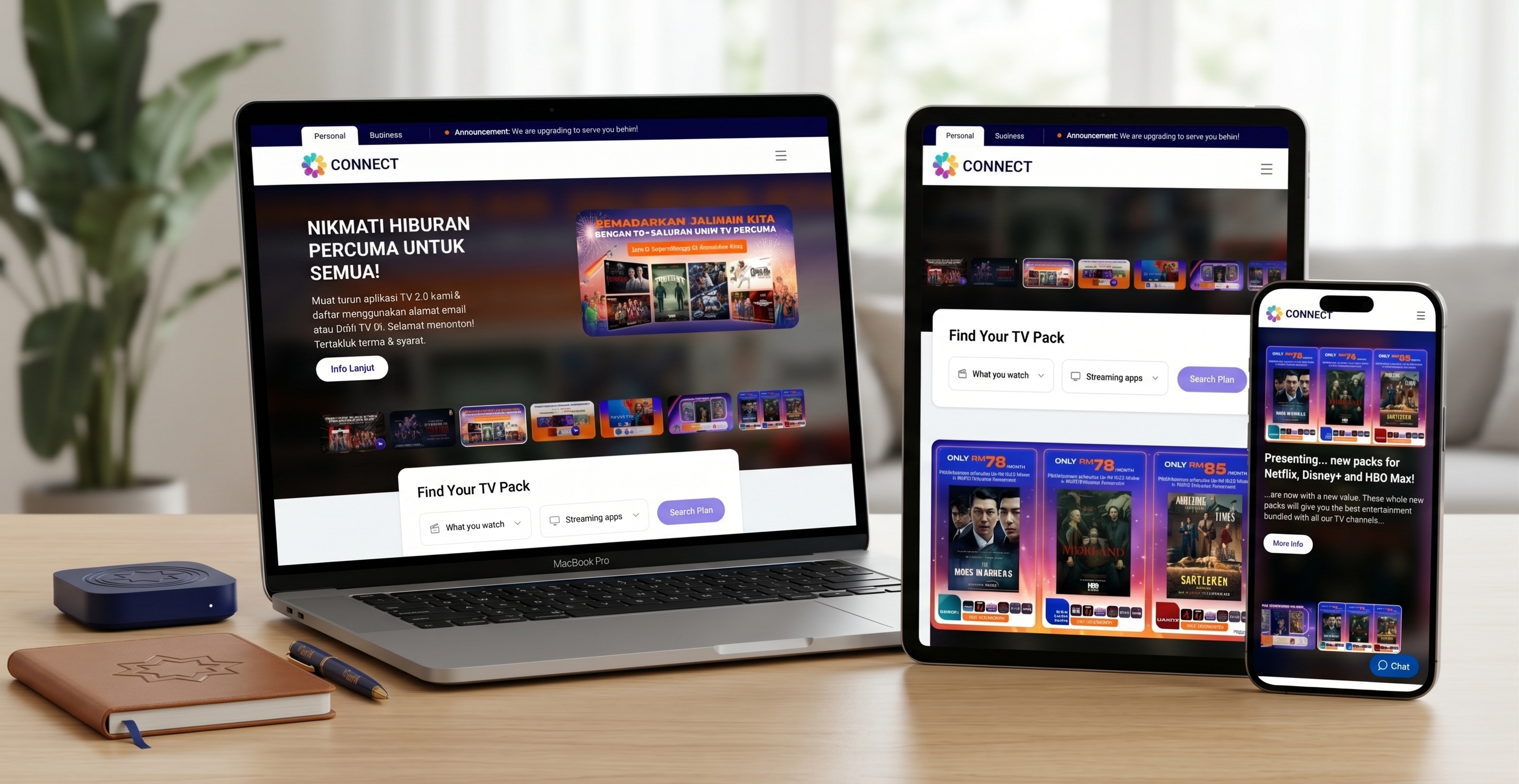
This one is told out of order. The middle explains the ending, and the beginning explains both.
Chapter one: a month after launch, the numbers were wrong
One of our microsites had been live for a month, and traffic was low.
Microsoft Clarity showed why. The way the interface elements were arranged, plus heavy animations, pushed load time up and pushed the main calls to action out of the first screen.
We raised it with the client before they found it themselves. That move did more for trust than any of the wins. To understand why trust mattered that much, go back a year.
Chapter two: a year earlier, the pitch that stumbled
I first met this project as a pitch. Halfway through, the pitch was not going well, and I was struggling to balance it with my day-to-day work. We won the contract, but only for a reskin, not the full redesign the client needed.
I was pulled into that reskin. A senior manager did most of the oversight, work that should have been mine. It helped. It also showed me, quickly, where my management gaps were. I had to learn them fast.
A year later the full project landed on my desk. Every earlier design had to go. The redesign would start from zero, and every stakeholder on both sides was watching.
The cast and the clock
- Milestones: five. Research, one microsite, and redesigns for three products.
- Team: three researchers and three designers at the core, several of them junior, not allocated full time; up to 9 people across milestones.
- Timeline: six months, with regular client check-ins and very tight iteration cycles.
- I owned: the information architecture, navigation and labelling principles, research direction, design direction, stakeholder alignment, and the parallel microsite work for other products.
- The team owned: journey mapping, usability testing, wireframes and mockups, under my direction.
Chapter three: day one, and what twelve months of data said
The real brief was conversion. Everything else served it. Improve engagement. Make that engagement lead somewhere. Improve conversion. Keep it after launch.
We pulled Google Analytics and Microsoft Clarity for the last six months and compared them with the six months before. The trend, not a snapshot.
- The plumbing was broken. Broken pages, dead links and redirect chains.
- Pages with nothing to say. Many pages had no relevant content for the person who landed on them.
- Structure that fought expectations. We usability-tested the layout and the order of content. It did not match what people expected to find, or where.
- Banner overload. Banners and promotions stacked on top of each other. Finding one piece of information felt like work.
- Loud colour, static information. The site looked vibrant. The information on it felt flat.
- No clear reason to choose. A visitor could not answer the only question that matters in this category: why buy a plan from this brand and not a competitor?
- Hard to scan, hard to decide. The home page and product pages carried a lot of information, none of it arranged to help someone compare and decide.
The cost showed up where it hurts a telco most. People who came to buy did not.
Chapter four: the wall
Diagrams on a screen were not landing with stakeholders. So I drew the entire existing information architecture by hand, on large sheets of paper taped together until they filled the room. Anyone could walk the wall and see where the site was hurting them.
Then I proposed the revamped IA, with principles for how navigation works and how labels are written. The client accepted those principles and started implementing them.
Chapter five: the fight for the hero banner
Product discovery has two owners. The business wants to push certain plans. The user wants the plan that fits their life. When those pull apart, the page turns into a negotiation, and the user loses. Our job was to guide people toward what the business wants to sell, only where it also matches what they need.
Inside the client, the negotiation was literal. Marketing, development and more, with marketing itself split into several teams, including social media strategy, each with its own KPIs. Every team wanted space in the hero banner. So we stopped treating it as one banner and designed it as a system:
- Room for most teams. Each team could promote its campaigns without taking over the page.
- Built around campaign rhythm. We mapped which campaigns run monthly, which quarterly and which once a year, and designed the spaces around that cadence.
- A story, then a decision. Each space had to tell the visitor something in sequence and move them closer to choosing. A slot that only filled space did not make the cut.
Chapter six: an assistant that reads clicks
This was the most important experience we designed, and it was new for a telco site. The idea came from travel booking sites and aggregators. They share the telco's problem: many products, many choices, and a visitor who has to become a customer.
We designed a discovery assistant, an integrated AI assistant that works two ways.
- On demand. A search widget lets people ask for key information straight away. Someone who does not want to browse can chat with the assistant and go from discovery to purchase in the conversation.
- When it earns the interruption. If people browse instead, the assistant watches for meaningful clicks, reads what they are probably looking for, and offers a quiet suggestion for the next step.
The rules are what make it work:
- Dead space stays dead. An accidental click on a blank area does nothing.
- Clicks that go nowhere get an answer. If someone clicks a banner with no call to action, the assistant wakes up. It does not repeat the banner. It tells them what they would get and points them to where they can act.
- Always there, never in the way. It stays available across the page and only comes forward on the right signals.
Chapter seven: the quieter moves that held it together
I taught the research instead of doing it. Several researchers were junior. Doing it myself would have been faster that week and slower for the rest of the project. I set the direction, showed them how journey mapping and usability testing are done, and stepped back. They delivered a readout of more than 300 slides combining usability findings, analytics, journey maps, market trends and recommendations.
Every screen traced back to evidence. Google Analytics and Microsoft Clarity for engagement and traffic, Similarweb for competitors. Wireframes first, then mockups. Every screen had to answer a problem the research had named.
Browsing spoke the local language. The site also sold OTT streaming services, and browsing them was dull. We designed a content-heavy browsing experience that highlights keywords inside the labels, using words and references people in the country use every day. Across the site, trigger points and visual cues guided people through the experience as a story.
Two design systems and a slow migration. The live site could not be replaced overnight. We built one design system for the site as it stood and one for the proposal. The rollout: make the design language consistent across the live site, bring in the new layouts gradually, then introduce the new design elements over time. Slower than a big-bang relaunch. It keeps the business running while the site changes underneath it.
AI inside the team, on a short leash. This was my third project using AI in the process, and the most controlled. Three narrow jobs: turning usability observations into insights, turning findings into a presentable deck format, and evaluating early designs to find gaps before iteration.
None of it was smooth. Many stakeholders were involved, and research did not always reach them without blocking design. There were back-and-forths. We influenced decisions, with struggle, and went back to the drawing board more than once before the concept and visual theme came together.
Epilogue: back to the month the numbers were wrong
That microsite failure is where this story started, because it is where the trust was won. The pitch had stumbled and the reskin had fallen short. Telling the client about our own mistake first was the move that made the rest stick.
- The IA took hold. The client accepted our navigation and labelling principles and began implementing them.
- The site is shipping. Some products are live with stakeholder backing. Others are in progress and planned to go live by the end of 2026.
- The client stayed. After the six-month engagement they signed a retainer, which has now run for more than a year. In the client's words, they needed our team.
- The team held its confidence. In our retrospective, the team said they felt confident under my leadership. The hiccups came mostly from the client side, some unavoidable and some we could have predicted.
- The cost. One microsite underperformed in its first month before we caught the cause.
Next time I would predict more of the challenges and prepare the team before they arrived. Some of the client-side hiccups were foreseeable, and I took ownership of those.
What I carry from it:
- Make the problem physical. A wall of paper did what a slide could not.
- Compare periods, not snapshots.
- Design the space for the calendar. Campaign cadence decides how a hero works, not the loudest team.
- Borrow from other categories. Travel aggregators had already solved part of our problem.
- Teach the method once, then trust the team with it.
- Migrate, don't replace.
- Report your own failures first.
Want the longer version of this story?
I can walk you through the decisions, the trade-offs and what I would do next.